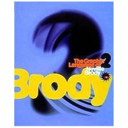
The Graphic Language of Neville Brody 2
Check my rate
| Main centres: | 1-3 business days |
| Regional areas: | 3-4 business days |
| Remote areas: | 3-5 business days |

| Main centres: | 1-3 business days |
| Regional areas: | 3-4 business days |
| Remote areas: | 3-5 business days |
Flip through The Graphic Language of Neville Brody 2 and you'll feel like you're channel surfing through the last decade of graphic design. Brody's typographical pyrotechnics, reproduced in color on every page, are both familiar and avant-garde. Although groovy Brody-designed fonts such as FF Blur have been used by designers in just about everything from annual reports to music videos, seeing them deftly manipulated by Brody's own hand (or mouse), is like seeing them again for the first time. They move beyond the threshold of cool. Here, in the context for which they were created, they make sense. Brody's design career began in London during the late '70s, where the catalyst for his first work- mostly album covers and fanzines - was the city's burgeoning punk scene. He moved on to become the art director of such acclaimed British magazines as The Face and Arena. By 1987 Brody had founded his own studio. While the first volume, The Graphic Language of Neville Brody, documented Brody's evolution from art student to Britain's most renowned graphic designer, this sequel chronicles Brody's exploration of the personal computer as an integral aspect of the design process. Author Jon Wozencroft, Brody's collaborator and a force in the founding of the Brody Studio, introduces the new work by describing a social revolution in communications, namely that of the shift from analog to digital technology. The computer's influence on design is hardly news anymore, but the eclecticism it has injected into Brody's visual lexicon may surprise you. On one page there's the bad boy Brody - distorting and layering text, stretching the boundaries of legibility. On the next page, a magazine spread is a paradigm of Spartan clarity. Chaotic and elegant, these images are guaranteed to thrill.
Paperback. English. Thames & Hudson. 1997. Good Condition.