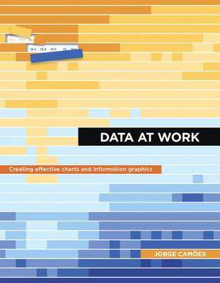
Data at Work - Jorge Camoes
Check my rate
| Main centres: | 1-3 business days |
| Regional areas: | 3-4 business days |
| Remote areas: | 3-5 business days |

| Main centres: | 1-3 business days |
| Regional areas: | 3-4 business days |
| Remote areas: | 3-5 business days |
Information visualization is a language. Like any language it can be used for multiple purposes. A poem a novel and an essay all share the same language but each one has its own set of rules. The same is true with information visualization: a product manager statistician and graphic designer each approach visualization from different perspectives. Data at Work was written with you the spreadsheet user in mind. This book will teach you how to think about and organize data in ways that directly relate to your work using the skills you already have. In other words you don't need to be a graphic designer to create functional elegant charts: this book will show you how. Although all of the examples in this book were created in Microsoft Excel this is not a book about how to use Excel. Data at Work will help you to know which type of chart to use and how to format it regardless of which spreadsheet application you use and whether or not you have any design experience. In this book you'll learn how to extract clean and transform data; sort data points to identify patterns and detect outliers; and understand how and when to use a variety of data visualizations including bar charts slope charts strip charts scatter plots bubble charts boxplots and more. Because this book is not a manual it never specifies the steps required to make a chart but the relevant charts will be available online for you to download with brief explanations of how they were created.
TITLE: Data at Work
AUTHOR: Jorge Camoes
SKU: 9780134268637
PUBLISHER: Pearson Education (US)
DATE PUBLISHED: 11/04/2016
PLACE PUBLISHED: United States
PAGES: 448
BINDING: Paperback / softback
LANGUAGE: English
DIMENSIONS: 181 mm x 229 mm x 20 mm
WEIGHT: 804 gr